
Jevon's Paradox Revisited
(Part 1)
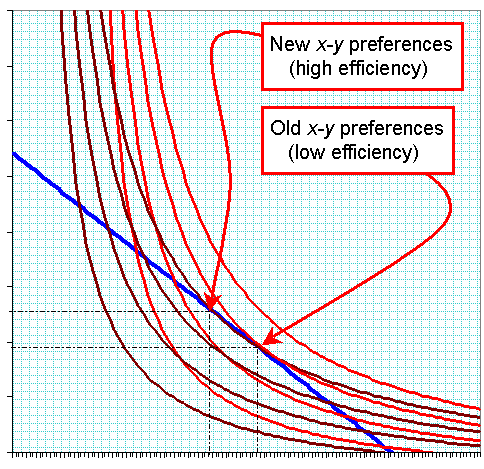
 Click for larger image Curved red lines represent different levels of "utility" (i.e., general well-being). Straight blue lines represent budget lines. Note: the utility curves are derived from a linear-expenditure model. |
The effect of a change in prices or the shape of the utility function is to alter consumption. An increase in income will lead to an increase in the consumption of both x and y, and therefore of utility U. The shape of the utility curve determines by how much consumption of both goods goes up. Usually, when I explain the concept I set y equal to a particular good of interest, and set x equal to everything else. This is because (a) we are interested in the effect of changes in price, etc. on one particular good among many that people tend to need; and (b) the usual supply-demand curves use the y-axis to represent the price of one particular good.
Reverting to my original analysis in part 1, we see efficiency having the exact same effect as a reduction in gasoline prices. In the chart, petrol prices have fallen 26% so you can now buy 35% more per dollar than you could before (or, conversely, engine output per unit of fuel has increased by 35%).1 The first thing we did was plot the new (dotted) budget line, with its steeper slope. There was an increase in liters of gasoline purchased by 37% and a 1.4% reduction in the physical amount/dollar amount of everything else. Utility has increased from the second red line to the third.
Not content with this, we are still interested in the income and substitution effects caused by this. So I plotted a "utility-equivalent budget line." This is a budget line that passes through the new (higher) utility function; but it has the exact same slope as the old budget line. If the same new level of utility had been achieved as a result of an increase in income (rather than an increase in efficiency) then gas consumption would increase by only 16%, while "everything else" would increase by 8.3%. The effect of increased efficiency was that consumers substituted gasoline for other forms of consumption: gas consumption rose another 17%, while consumption of everything else fell 9%.
The significance of the two effects is not trivial. To the extent that the concepts explained above are to be taken seriously, policymakers can use taxes and subsidies to correct for perverse substitution effects. A fairly common proposal related to peak oil and ACC concerns is to restructure tax policies to offset the substitution effects caused by (say) higher CAFE standards. In other words, it would be necessary to raise gas taxes in order to pay for reductions in other taxes.
___________________________________
 This illustrates a shift from one utility function (red) to another (brown) as a result of more efficient use of y. |
The graph above illustrates the shift in x-y preferences caused by increased efficiency. In the scenario I depicted, the four brown curves represent (left to right) the same four successive levels of utility as the red curves. The same budget line is is tangent to a higher "brown"indifference curve than "red" indifference curve. This time, the increase in efficiency has caused gas consumption to increase by 33% (about the same as the price decline did) but since there's no "income effect," the substitution is much larger: a 20% decline in the consumption of "everything else." Now, to clarify a point I hinted at in the previous entry: this is a bit ominous because the ratio of energy expenditures to other things has increased by a lot more than if we approximated efficiency increases by slashing the "price" of gas. In the first scenario, energy efficiency had gone up, making the dollar worth more (since more energy-intensive stuff could be bought), so the economy become somewhat more energy intensive. In the second scenario, we've faithfully replicated the changed technical conditions, with the result that the economy becomes a lot more energy intensive.
As I've mentioned as often as practical, these utility functions, graphs, and inferences are mostly arbitrary. One of many problems with the utility function, for example, is that it's long been insisted by economists that the function U(x,y) only allows you to supply a rank for different values of x and y. In order to plot these numbers at all I had to create a function in which U was a specific numerical value: 20, 30, 40... The logical implication was that 3 units of gas and 6 units of everything else, say, would produce a utility of 20, whereas if gas were increased to 8, utility would be 40. This does not mean that a 2.67-fold increase of gas consumption will make one twice as happy as before, though; it only means that one is in a position that is preferred to one in which utility = 20.
This may seem like a manageable arrangement unless we consider the thorny problem of comparing different utility functions. With a new utility function we need to compare the utility furnished by old and new bundles of goods, which cannot really coexist in time for purposes of comparison.
A more sensible handling of utility is to begin with the explanation that we aren't really measuring "well-being" in a meaningful sense, anymore than average GDP per capita measures "well-being." We are actually measuring something known more properly as "welfare," which is a rational deduction of well-being based on the ability of an economic actor to exchange or arrange what she has to achieve something nearer to her heart's desire. Welfare, another subject unto itself, could be said to capture this concept.2
_______________________________
Notes:
1 The attentive reader will notice that I'm actually saying fuel efficiency went up by 35%, which is exactly the same as the price of gas declining by 26%. We calculated that the actual amount of money spent on gas, or expenditure, went up 2%, while money spent on other stuff went down 1.4%. An implication of this is that people spent about 40% of their income on gas. This is really an exaggeration, even if we pretend "gasoline" refers to all forms of energy and include indirect purchases of energy, e.g., the share of a pizza's cost that goes towards the gas used in delivery, the natural gas used in baking it, the nitrates used in the cultivation of the wheat and tomatoes, and so on. Still, if we did account for costs like that, I think energy would account for a solid 7% of GDP.
By the way, if I had used a Cobb-Douglass utility function, then the expenditure on energy would remain entirely unchanged. This makes no sense to me: if something suddenly provides more satisfaction per dollar spent, and if you are free to do so, you will tend to spend more dollars on that thing than you did before.
2 See Partha Dasgupta, On Well-Being and Destitution, Oxford University Press (1993), p.70ff. Unusually for this blog, the link goes to a display of the actual page in Google Book where the explanation begins. Dasgupta, however, does not propose to measure well-being/welfare (W) as an alternative to utility, but as an enhanced version of it: freedom plus utility. I think this misses a splendid opportunity.
Labels: economics, efficiency, environment, peak oil, utility
posted by James R MacLean @ 11:03 PM
0 comments
![]()
![]()


0 Comments:
Post a Comment
<< Home