
The Dynamics of Industrial Choice (1)
Often, economic models seek to explain business decisions based on a snapshot of conditions. Hence, we have the case of the indifference curve and the production curve. Both are closely analogous:
INDIFFERENCE CURVE
In economics, one speaks of "utility" as a state that cannot be measured, but can be compared; so, for example, in the chart below, the blue line (U1) represents a lower lever level of utility than the red (U2). It is not valid to say U2 represents 1.5x as much utility, but we can include a very large number of intermediate levels of utility between the two points.
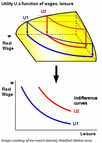
Utility is always described as a function of two sources, such as "wages" and "leisure" (from the POV of the worker). Of course, if you increase wages without reducing leisure, or increase both, then the person obviously has a higher level of utility. But what about when one must trade one for the other?
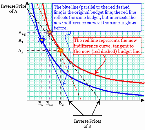
In the graph above, the economic actor's utility is a function of A and B. The red line is the result of a sudden decline in the price of B. When that happened, the "budget line"—the straight dashed lines slicing diagonally across the graph—moved outward, to the right. That diagonal line intersects the A-axis at the point where the consumer spends 100% of her income on A, and the B-axis where she spends 100% of her income on B. So when the price of B fell, the budget line moved outward to intersect with a new, higher, level of utility.
When the consumer had the lower (blue) budget line, she consumed A1 and B1. When the price of B fell, her consumption of both increased, to A2 and B2. But economists make a distinction between (A2, B2) and (A1.5, B1.5). While some of the change in consumption (ΔA,ΔB) can be explained by the increased income—i.e., the new, "purple" flashpoint on the red curve above—some of (ΔA,ΔB) is the result of substitution. So, for example, the increased real income caused by a decline in the price of B actually caused the consumption of A to decline in absolute terms. An income effect will always cause both to increase, but a substitution effect will always cause consumption of one to fall relative to the other.
OUTPUT CURVE
This is closely analogous to the indifference curve, and so I used a similar graphic with different labels (the original graphic is here).
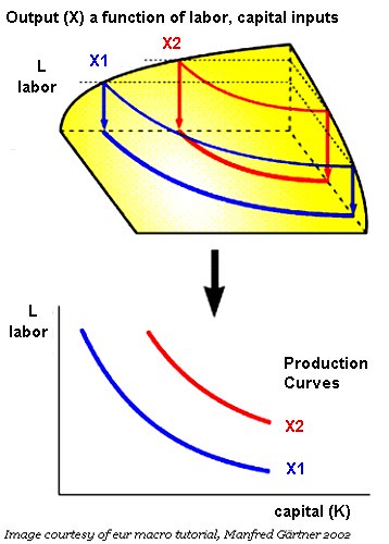
Here, the tradeoff is between labor (L) and capital (K), or any other combination of inputs. While I've shown only two inputs in the diagram, it's possible to set up optimization equations involving as many inputs as you like... such as different capital structures (bonds versus bank loans versus equity), energy inputs, and so forth. One element that is new to the production curve here is the idea of technology: the possibility that output (X) can increase without an increase in L or K. In fact, economists simply treat technology as another input (A), and have long debated the role it plays (here's a formal treatment).
The concept of the indifference curve in economics dates back to the 1870's; some of the first economists to use it were the "Marginalists," such as William Stanley Jevons (1871) and Leon Walras (1874). A formal explanation of these concepts may be found here.
PARETO OPTIMIZATION
Pareto Optimization is illustrated by the Edgeworth Box shown below. It's really just a pair of indifference curves. One thing to remember is that, while the vertical axis shows rising wages, the direction of the horizontal axis is reversed. That's because the "zero" axis for the utility of the owner of capital is in the extreme upper right-hand corner of the graph.
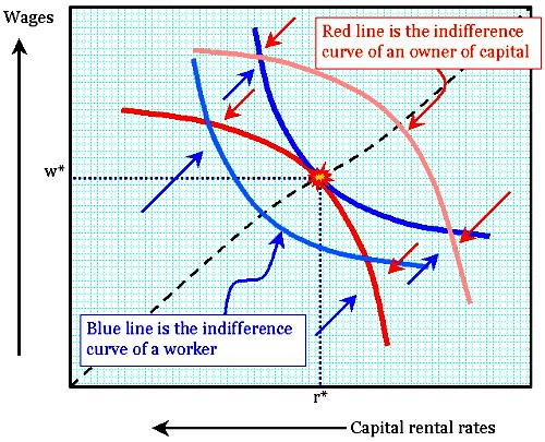
According to this chart, the rising rate of wages is one contributor to the utility of the worker; another contribution is lower interest rates (or capital rental rates). The latter effectively increases the purchasing power of the worker.
(Incidentally, this is not a radical or leftist conception of labor-capital relations. It's from the work of Francis Ysidro Edgeworth and Vilfredo Pareto, two of the most conservative, orthodox economists who ever lived. Anyone who is seriously disturbed by my dichotomy can relax. Everyone agrees that there's a missing dimension here, which is that of time. A reasonably high value of r leads to an increase in the accumulation of capital, allowing for greater total output.)
The object of this diagram was to illustrate how the market, under optimal conditions, resolves the controversy of the correct distribution of the total economic output between labor and capital. This same dichotomy of interest also exists between producers and suppliers, or taxpayers and the state.
However, the chart also illustrates something else: one can see here the idea of demand reaching a convergence with available output. The optimal solution is one where the rate of indifference is the same as the comparative cost, which is (in turn) determined by the output function.
(Part 2)
Labels: economics, general equilibrium, indifference curve, Pareto optimization, planning, utility
posted by James R MacLean @ 11:58 PM
0 comments
![]()
![]()


0 Comments:
Post a Comment
<< Home